DESIGN PORTFOLIO
Washington University (St. Louis, MO)
Washington University in St. Louis is a private research university in St. Louis, Missouri.
I worked closely with a team from the Arts & Sciences research department to design and format the 23rd volume of The Gateway HIstory Journal. In order to showcase the student’s analysis, research, and writing, I was tasked with the challenge to make dense blocks of text more digestible.

Philippine Historical Village Site (St. Louis, MO)
The Philippine Village Historical Site is a living monument in Clayton, Missouri that holds space for respectful engagement with the aftermath of the 1904 World’s Fair and the accurate telling of history with the perspectives of Filipinos and Indigenous Peoples at the forefront.
I was commissioned by the founder of the Philippine Historical Village Site in partnership with the City of Clayton and the Clayton Community Foundation to create two promotional posters for the April 2025 historical marker ceremony. The challenge was to create two separate advertisements that incorporated elements of the site marker while appealing to multiple demographics. I created a suitable color palette that could be applied to both posters while using illustrative design techniques for one and real world photography for the other. Ultimately both posters were employed for the promotional campaign to great success exemplified in the large attendance of the ceremony.


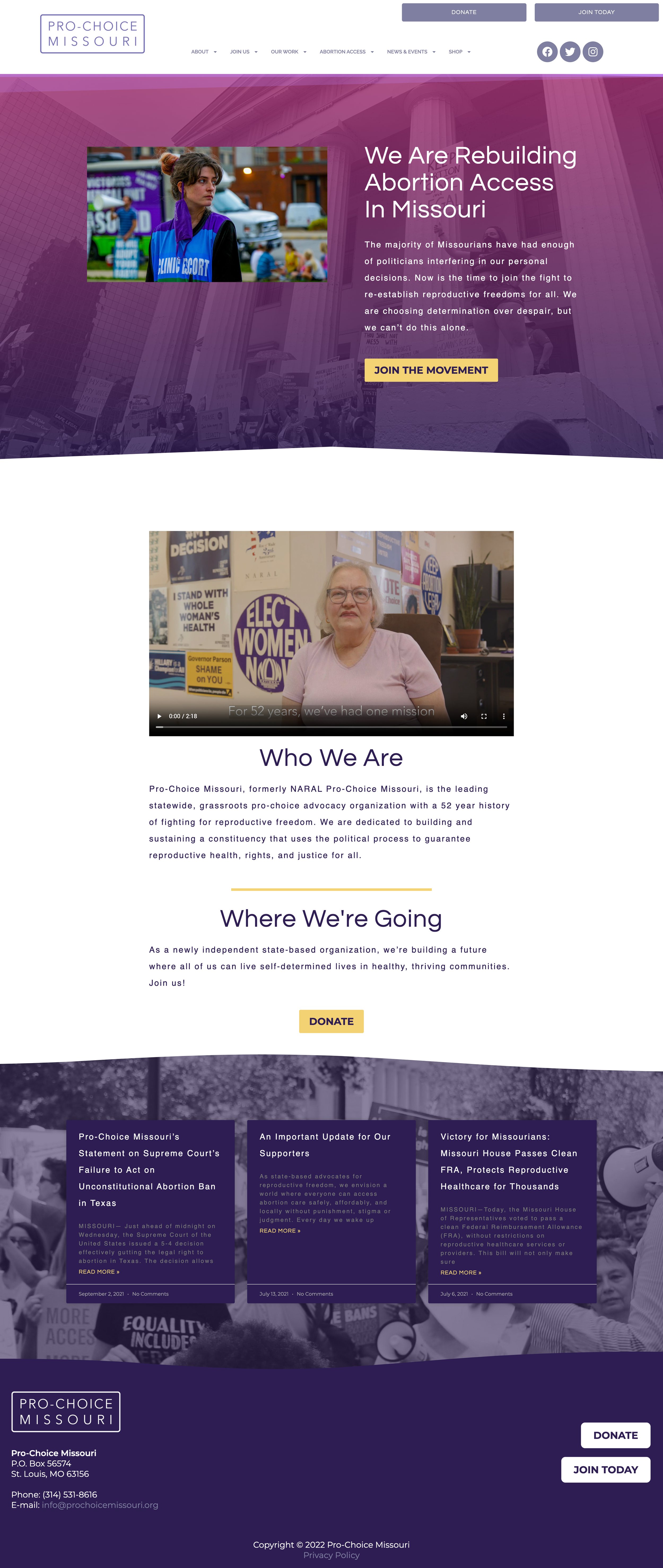
Abortion Action Missouri (St. Louis, MO)
Abortion Action Missouri is a non-profit organization whose work envisions a world with stigma-free abortion access and reproductive freedom for all.
I have worked closely with the organization through their days as NARAL Pro-Choice Missouri and onward towards their rebrand in the summer of 2023. Across a variety of different digital and print projects, I implemented existing branding identity assets within brand guidelines to create political endorsement mailers, briefs, special reports, and social media assets.


Before rebranding as Abortion Action Missouri, the organization was simply known as Pro-Choice Missouri (formerly NARAL Pro-Choice Missouri). The org was a statewide, grassroots pro-choice advocacy organization with a 52 year history of fighting for reproductive freedom.
I worked closely with the communications department across a variety of projects including logo design, website design, digital/print materials, annual gala branding and social media assets.
Featured below is a printed campaign mailer for the Kansas City 2023 Municipal General and Special Election. The mailer called for featuring images of the org’s roster of pro-choice candidates and creating a “Pro-Choice Missouri Endorsed” logo modeled after the org’s existing logo. By working with their color palette and signature gradient I was able to effectively highlight the candidates and the org’s message.

Leading up to the mayoral race for Mayor Tishaura O. Jones, I worked with a coalition of progressive non-profits (NARAL Pro-Choice Missouri, SEIU, and Action St. Louis Power Project) to create a joint campaign mailer. The project called for creating an engaging, yet straight forward mail piece that conveyed the accomplishments and future goals of the then mayoral candidate.


I was commissioned to create the artwork for Pro-Choice Missouri’s promotional merchandise. I worked with the communications team by sorting through a variety of inspirational references. We landed on this 4 photo image utilizing the org’s branded colors palette.


Reinvention Lab at Teach For America
(New York, NY)
Reinvention Lab at Teach For America builds new offerings for TFA that reinvent education by sharing what they learn through research & development work to shape the future of the org.
On this project, I worked closely with the creator of the written piece and a freelance illustrator to create a layout for a report that focuses on “rest as a liberatory practice.” The challenge was to invoke the concepts of rest, serenity, and regeneration across the text layout while working within the branding guidelines of the org. By creating a calming color palette of different shades of blue, using a combination of organic shapes, and incorporating the illustrations, I helped accomplish the goals of the piece.

Democracy Forward (Washington, DC)
Democracy Forward is a 501 non-profit and non-partisan legal services and public policy research organization in Washington, D.C. that uses the law to build collective power and advance a bold, vibrant democracy for all people.
I worked closely with their founder and communications team to create a report that could be distributed to potential donors in order to explain the org’s mission, strategy, and plan forward. By adhering to their branding guidelines, I solved this issue by creating a document that was bold and straight forward in communicating their urgency in meeting the moment.
www.democracyforward.org


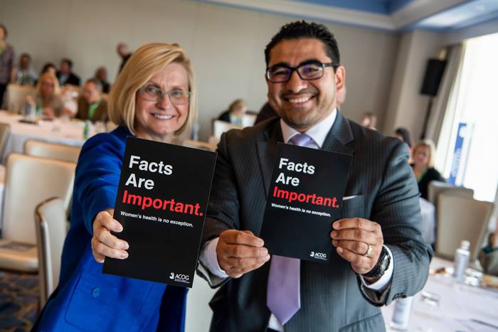
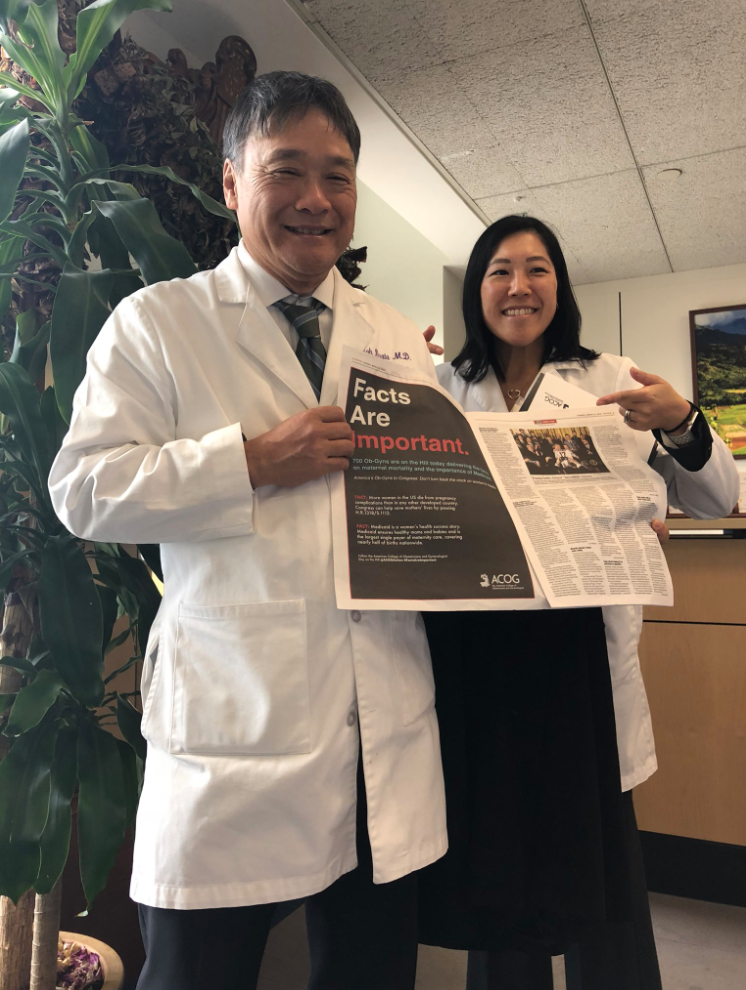
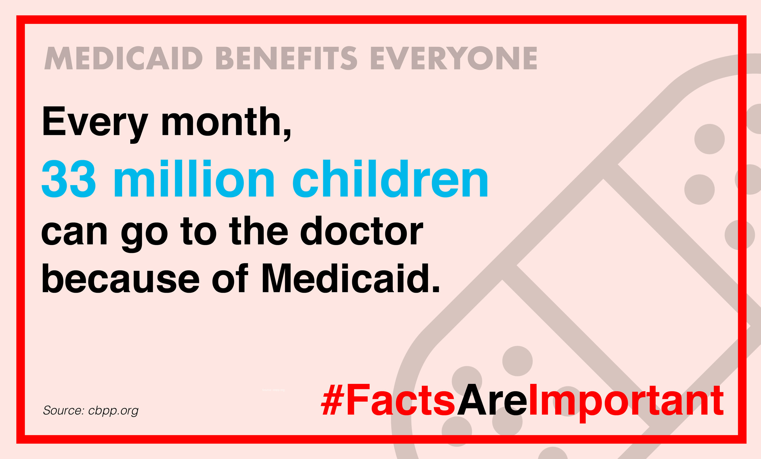
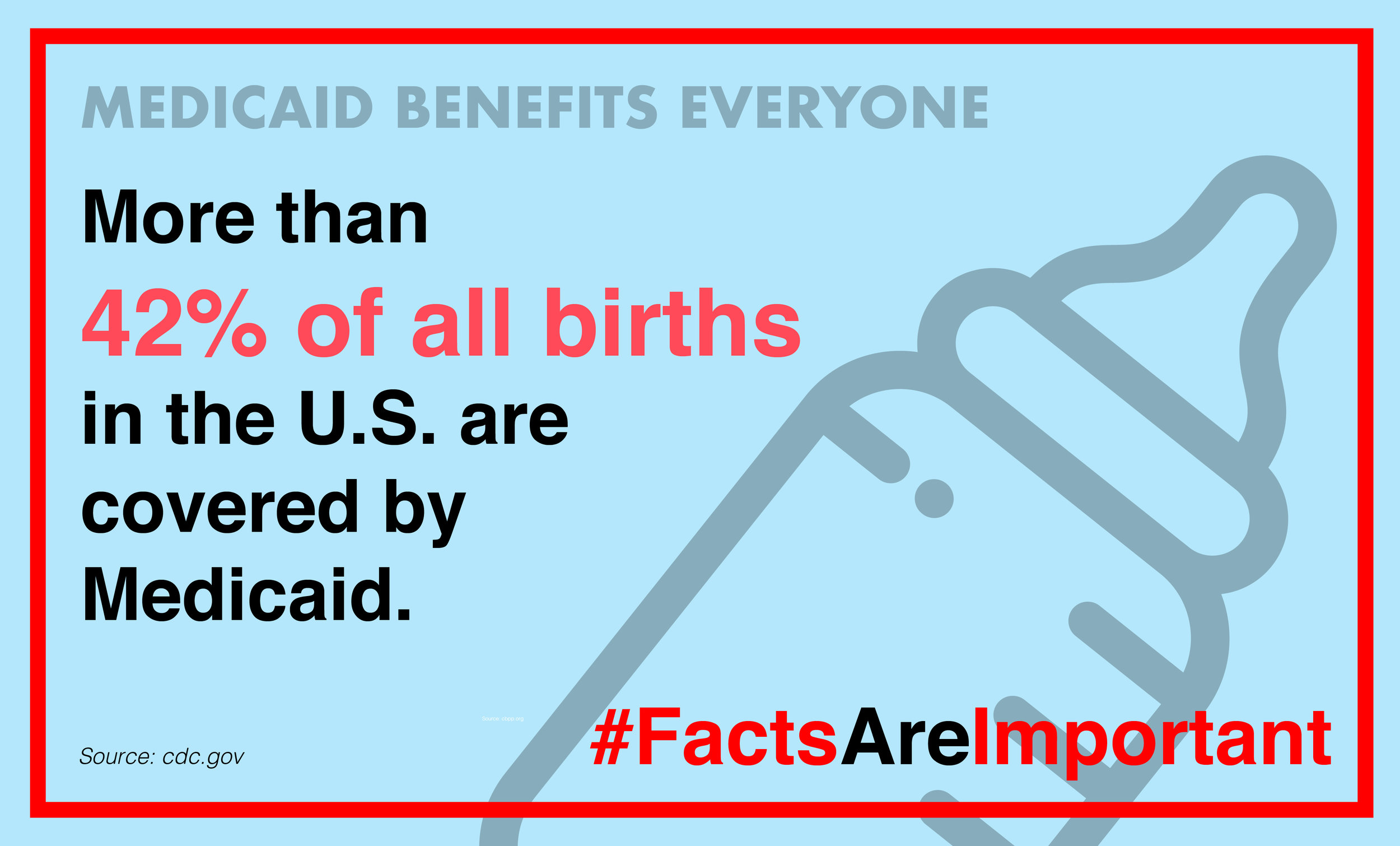
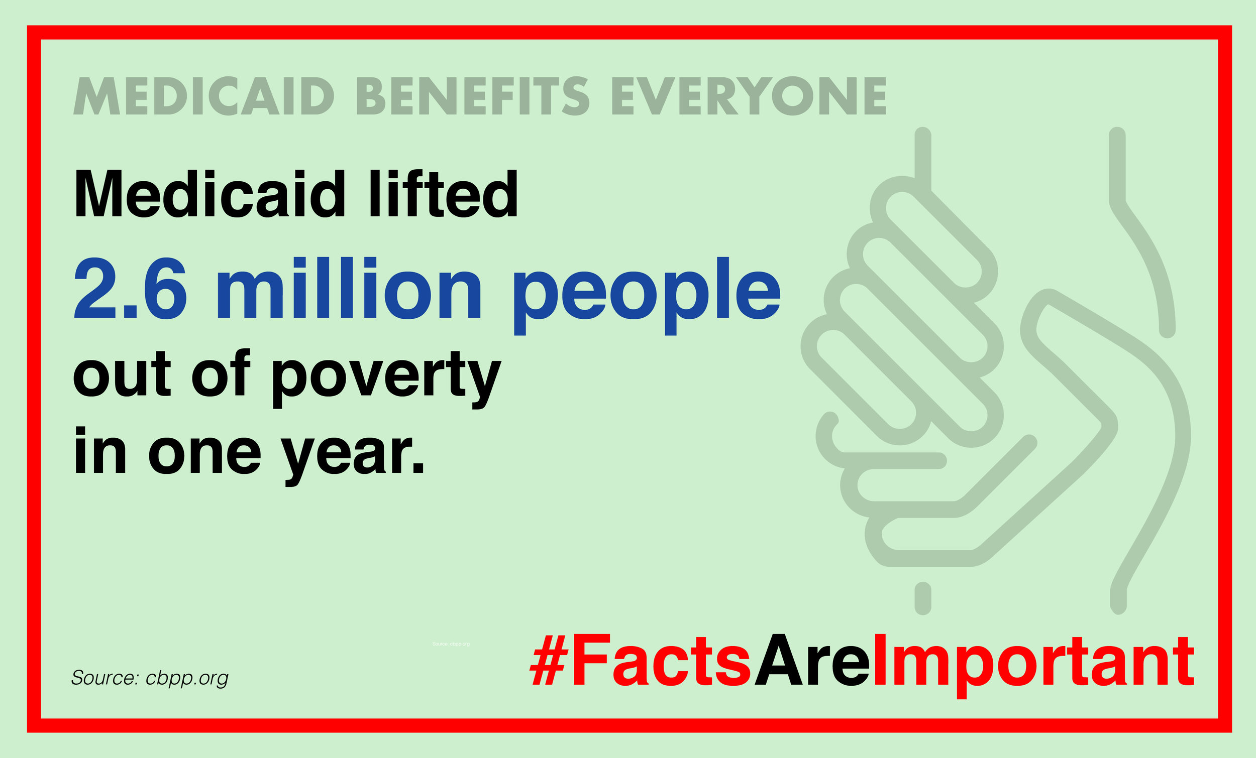
American College of Obstetricians and Gynecologists (ACOG) (Washington, DC)
The American College of Obstetricians and Gynecologists is the premier professional membership organization for obstetrician–gynecologists.
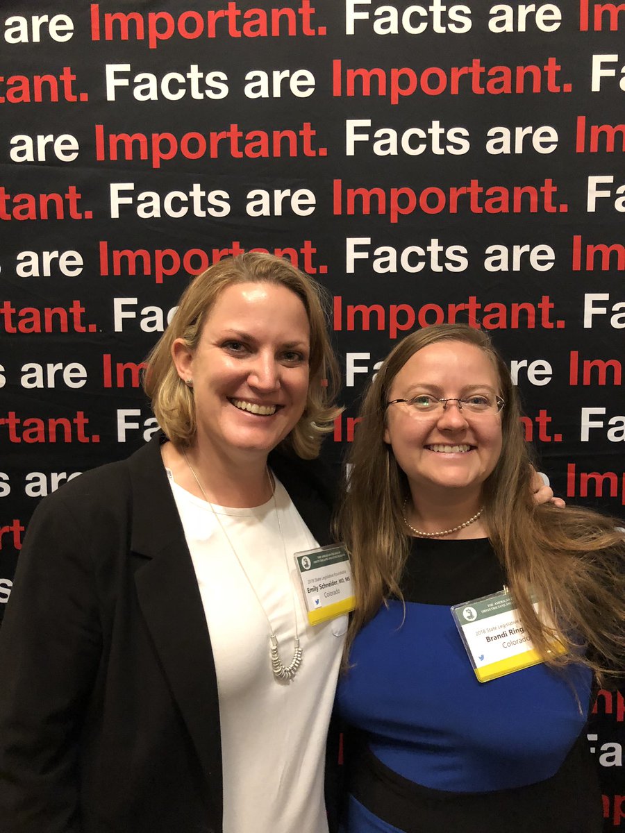
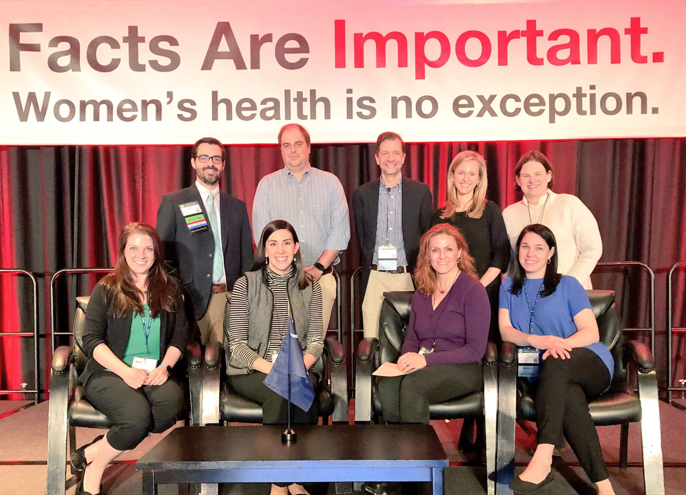
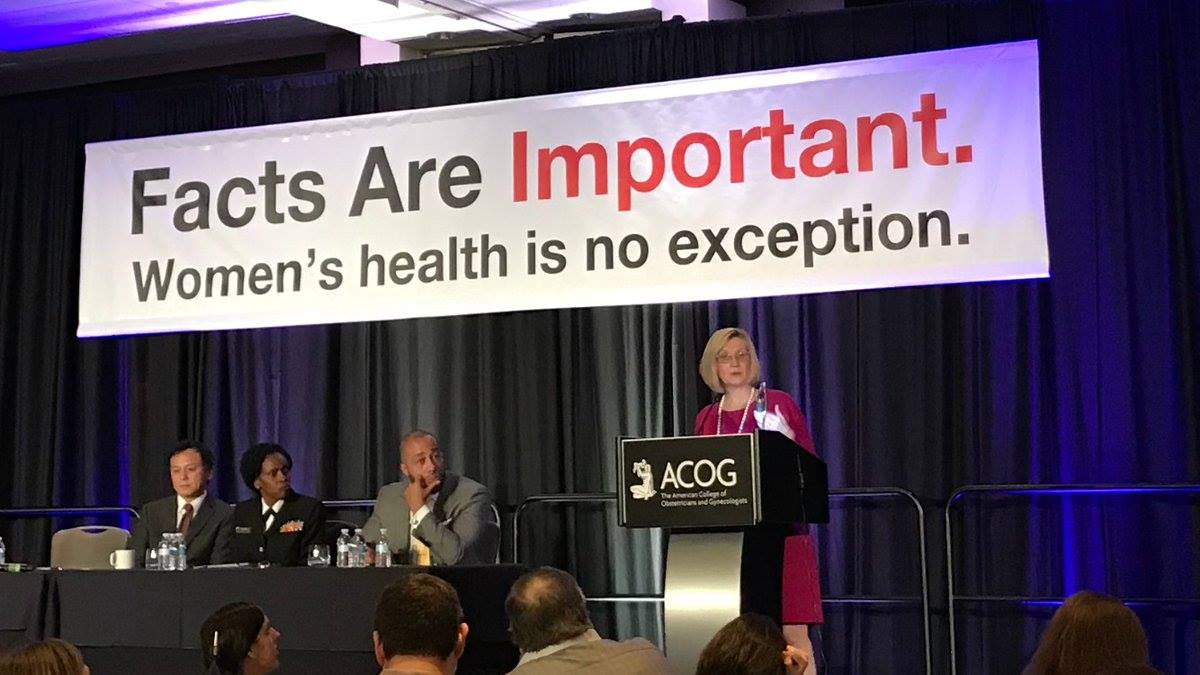
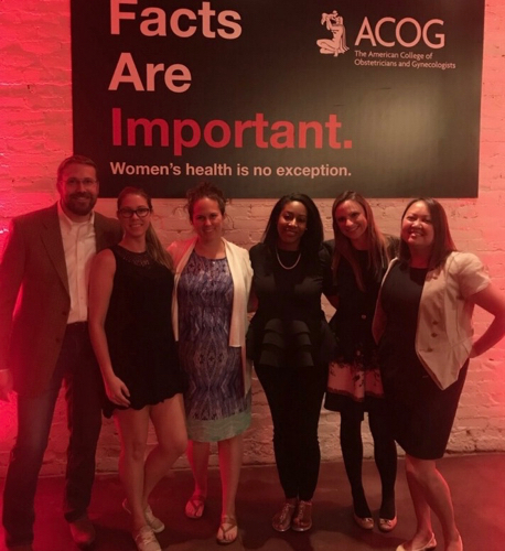
I created the concept for and executed the org’s entire #FactsAreImportant campaign for The American College of Obstetricians and Gynecologists 37th Annual Congressional Leadership Conference (CLC), including: full-page ad in Politico, conference branding, annual report, conference program, and supplemental graphics. ACOG went into the 37th CLC wanting to convey their messaging clearly adn concisely. I worked with the communications team and decided to heavily into elements of Swiss design and strong typography.

Full-page ad in POLITICO, print edition


2021 Congressional Leadership Conference - ACOG-shirt design for ACOG’s 2021 Congressional Leadership Conference.

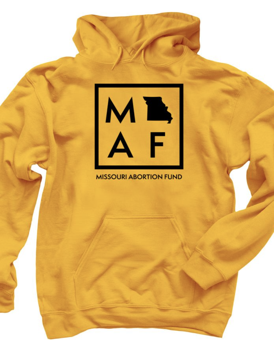
Missouri Abortion Fund (St. Louis, MO)
The mission of Missouri Abortion Fund (MoAF) (formerly Gateway Women’s Access Fund) is to provide public education and support for people needing reproductive health services, primarily by providing financial assistance for Missouri residents who cannot afford the full cost of abortion care.
I was hired to work on Missouri Abortion Fund’s rebrand as they transitioned from Gateway Women’s Access Fund. By partnering with members of the MoAF team, I created a new logo and designed a website that was both inviting and informative.
www.mofund.org


Niche Food Group (St. Louis, MO)
Niche Food Group is a St. Louis based restaurant group headed by executive chef Gerard Craft.
I was commissioned by NFG to create a new logo for their signature beverage The Unusual Negroni. I worked in Adobe Illustrator to envision something bold and vibrant. I took the shape of the circle from NFG’s Pastaria logo to reference both the existing restaurant and the shape of an orange and the negative shape of a spiral or ‘peel’ that is a signature ingredient in a negroni. I used a playful mixture of typography to create a sense of mystery.
www.nichefoodgroup.com

Duende District Bookstore (Washington, DC)
Duende District is a mobile pop-up bookstore that is curated by and for people of color — where all are welcome.
I worked closely with the bookstore’s founder to create a website that was simple in use and incorporated their existing brand identity.


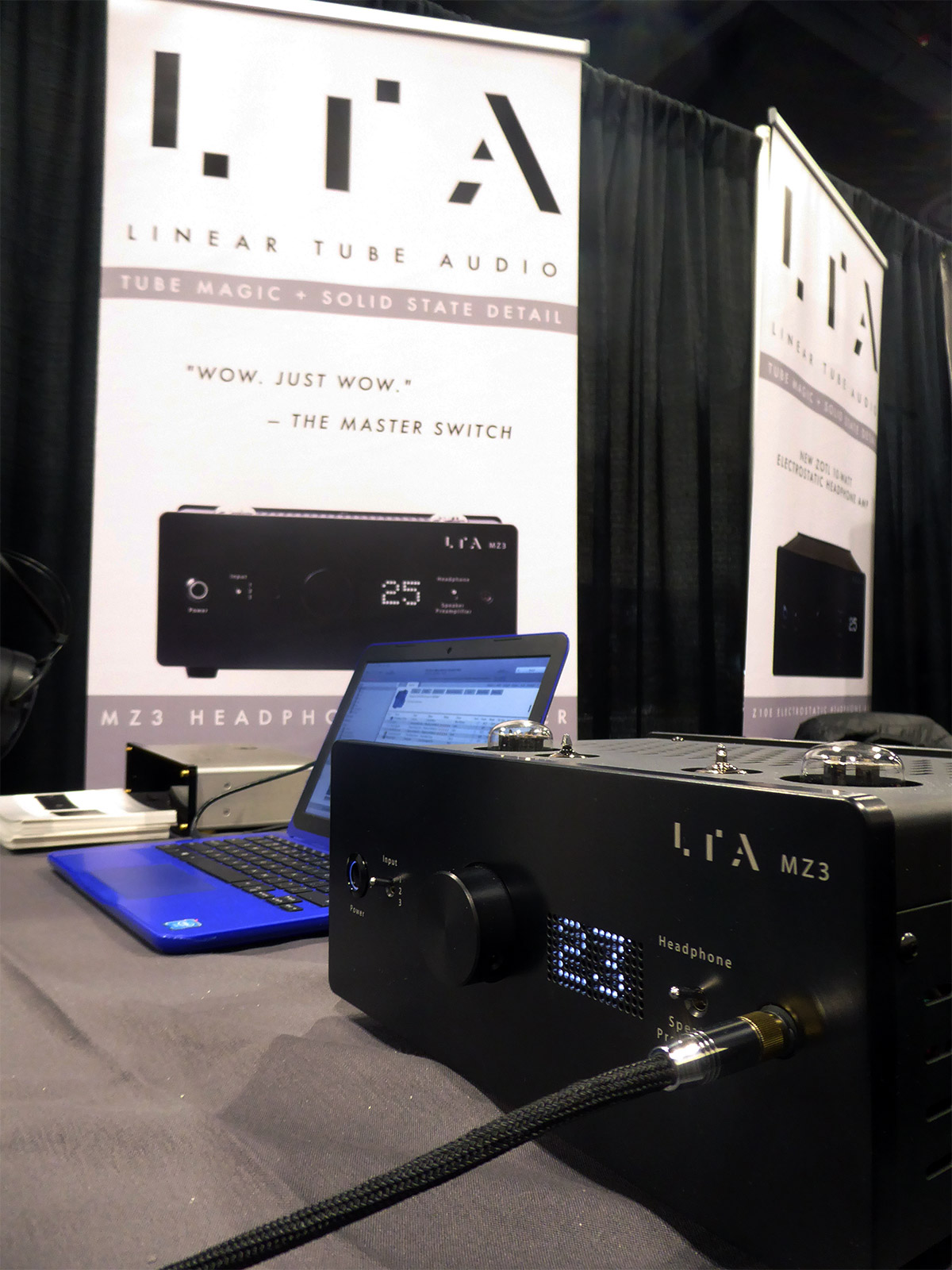
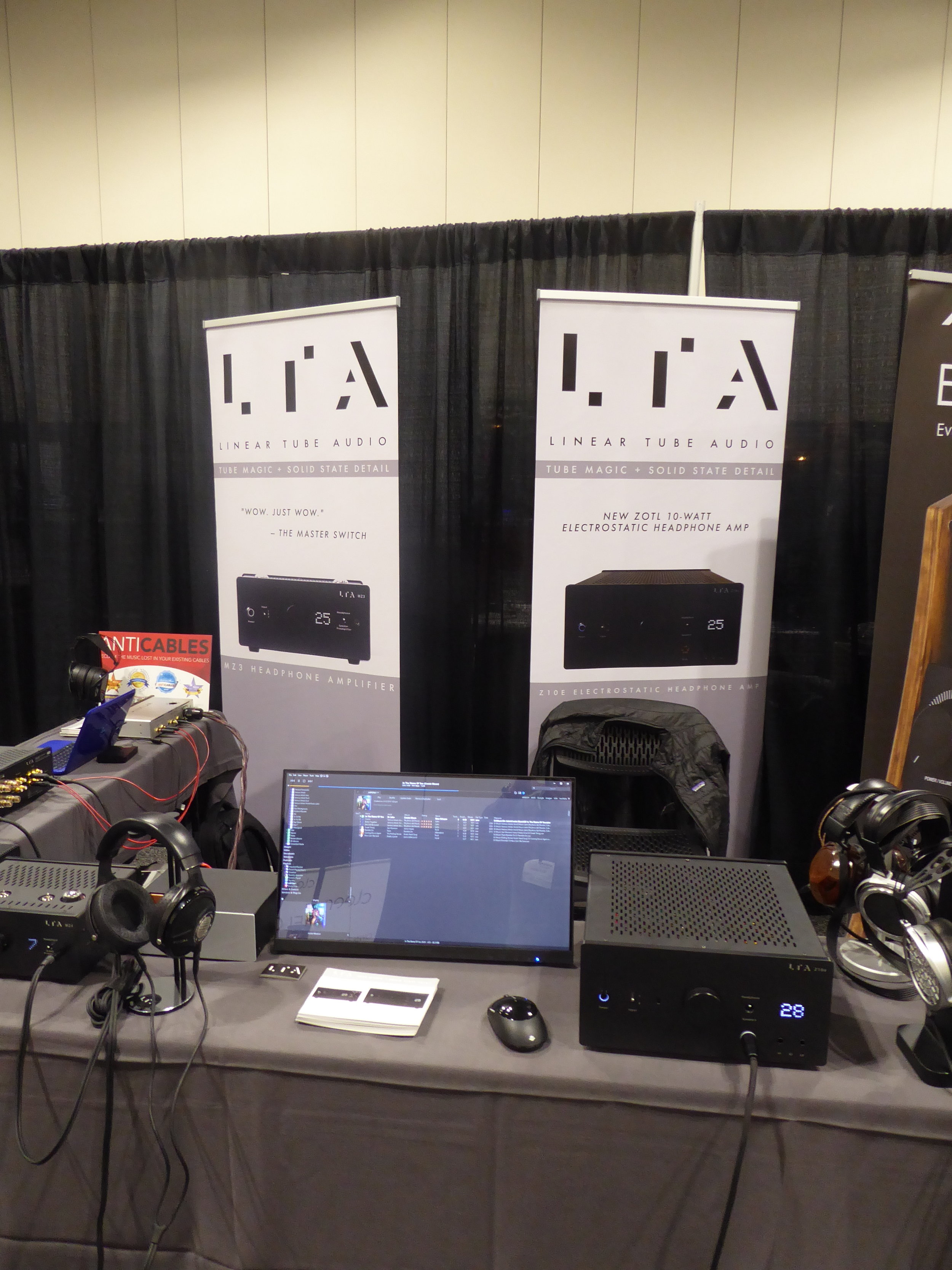
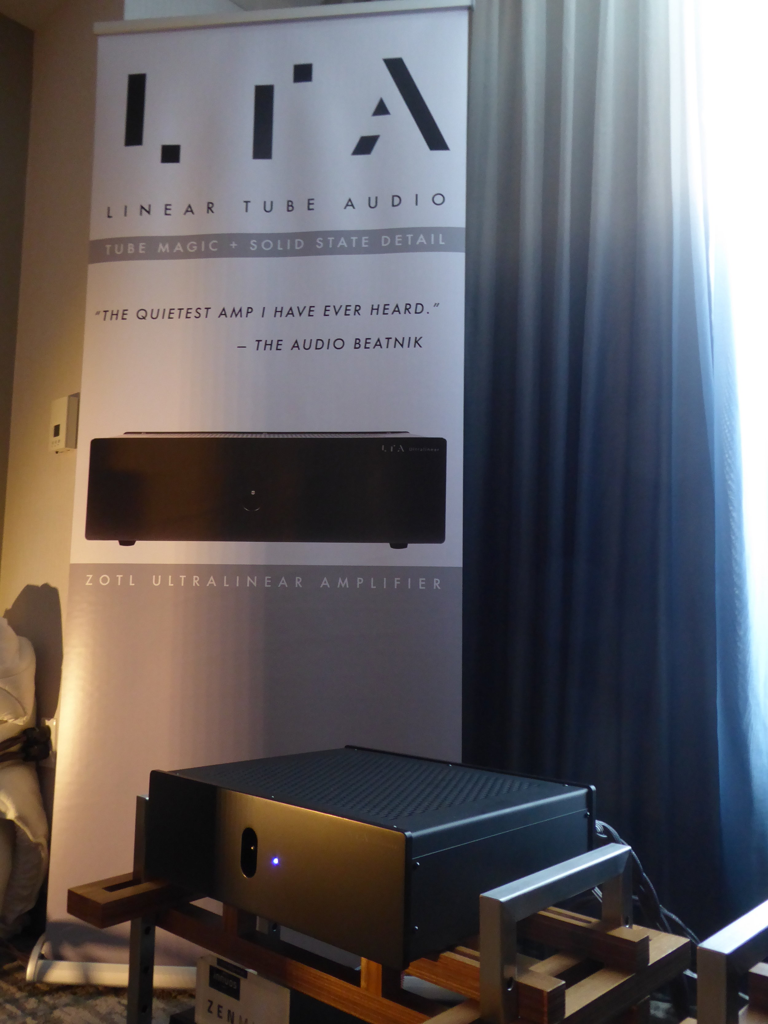
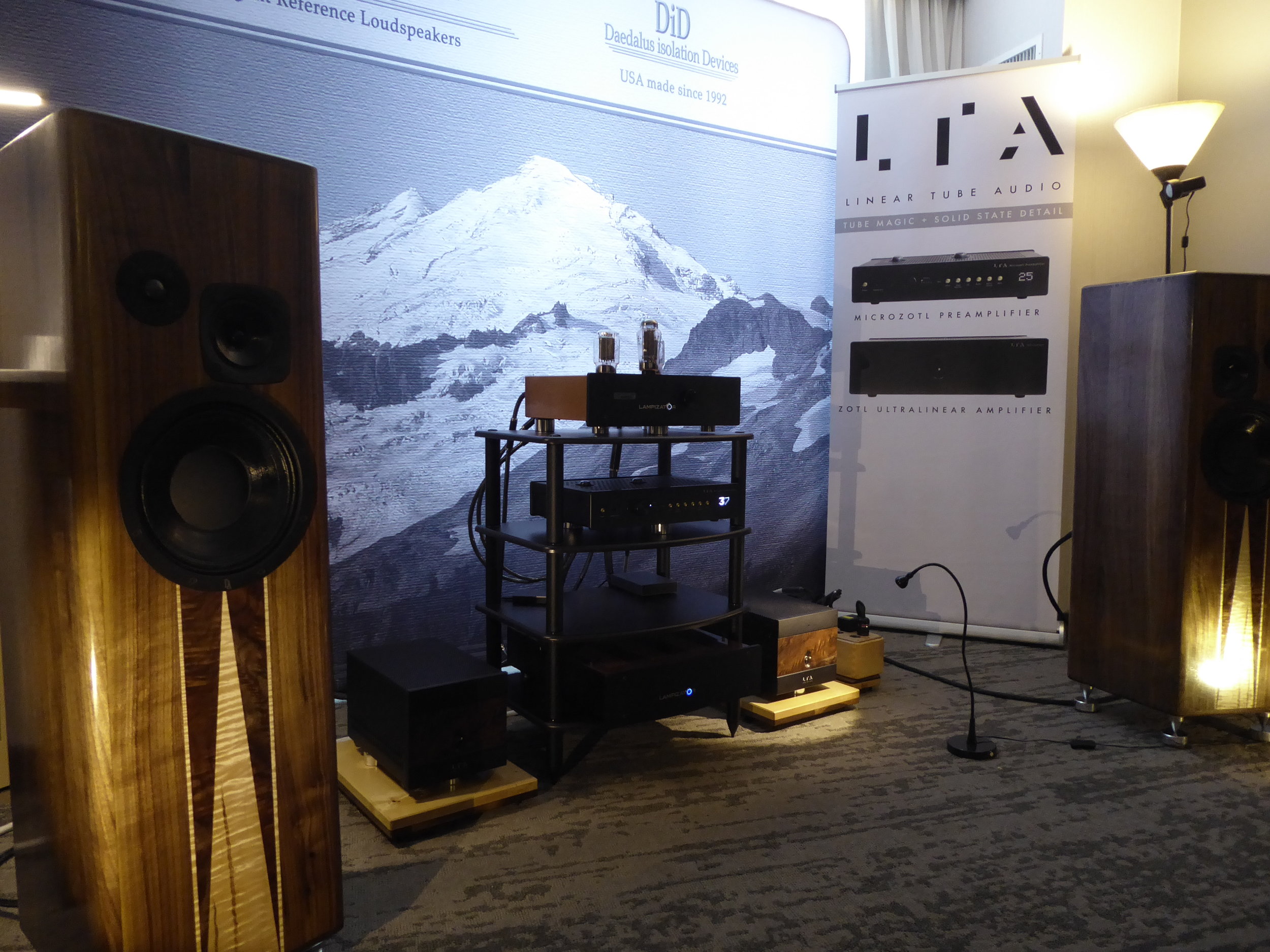
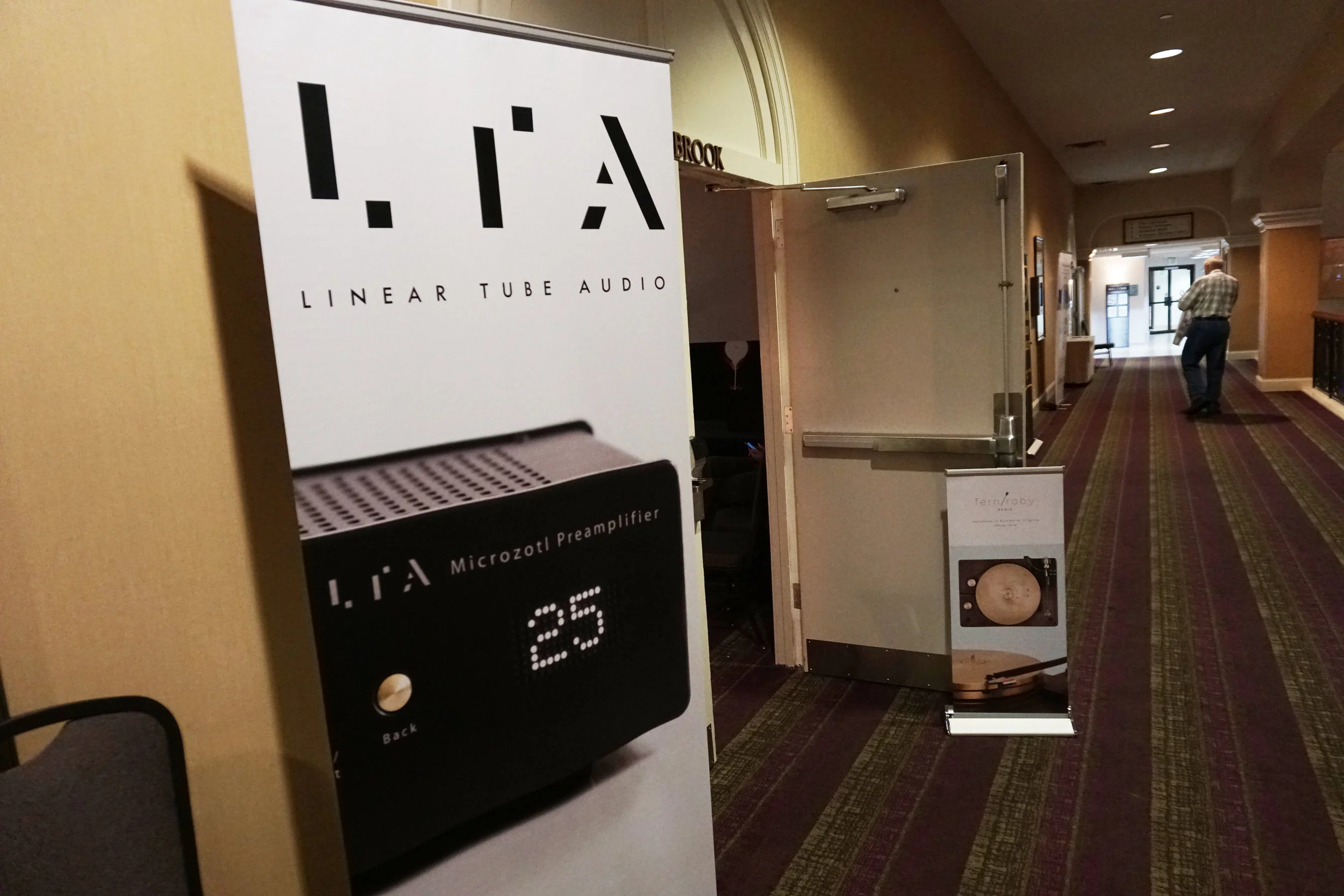
Linear Tube Audio (Washington, DC)
Linear Tube Audio is a boutique, high-fidelity audio manufacturing company whose mission is to bring life back to music at an affordable price.
I was hired on to create visual branding materials for their Fall 2018 product launch including printed promotional materials, banners, website, and social media. All of the assets I created were used in numerous demo presentations at several rounds of audio conferences across the country.
https://www.lineartubeaudio.com


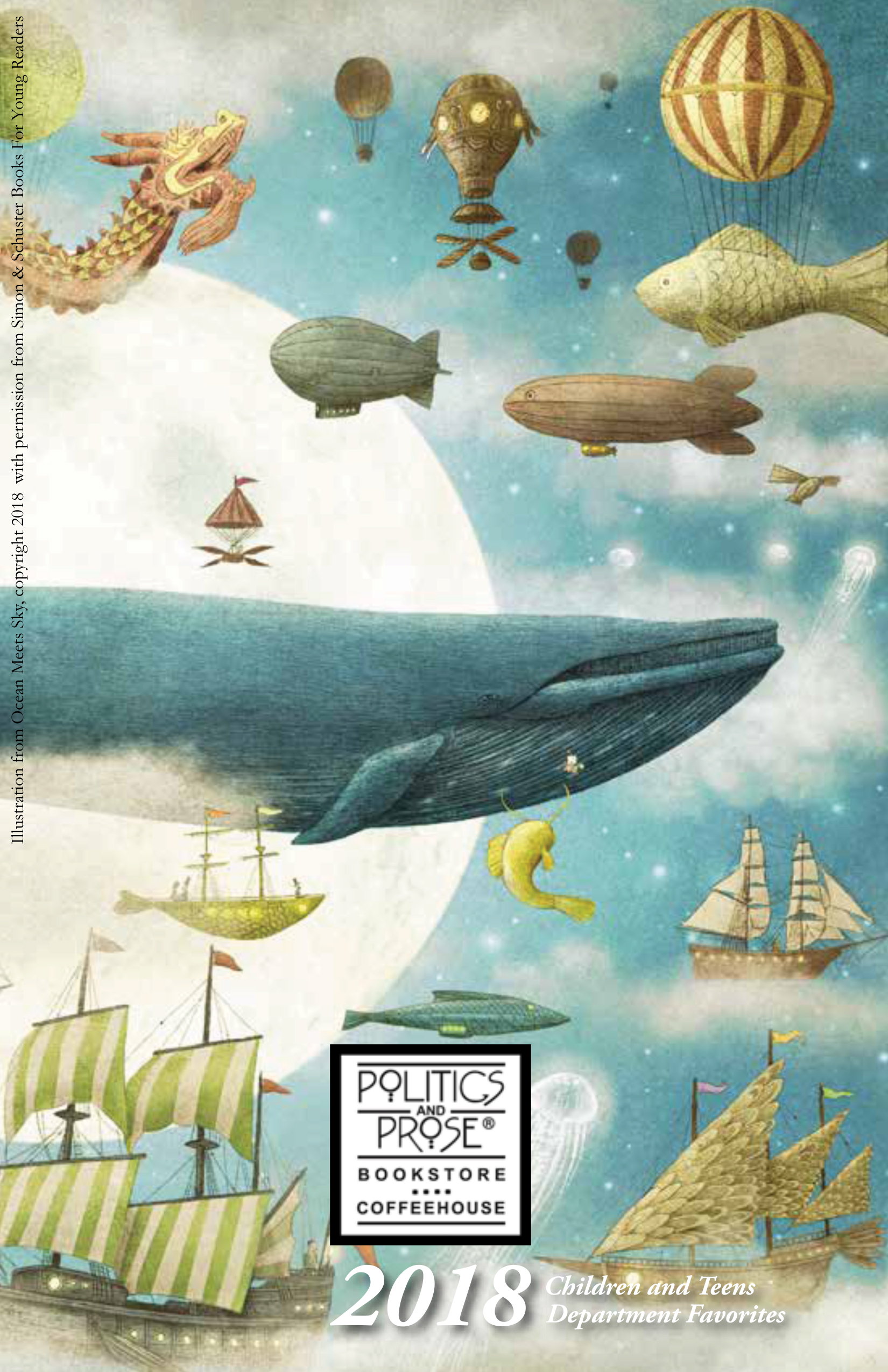
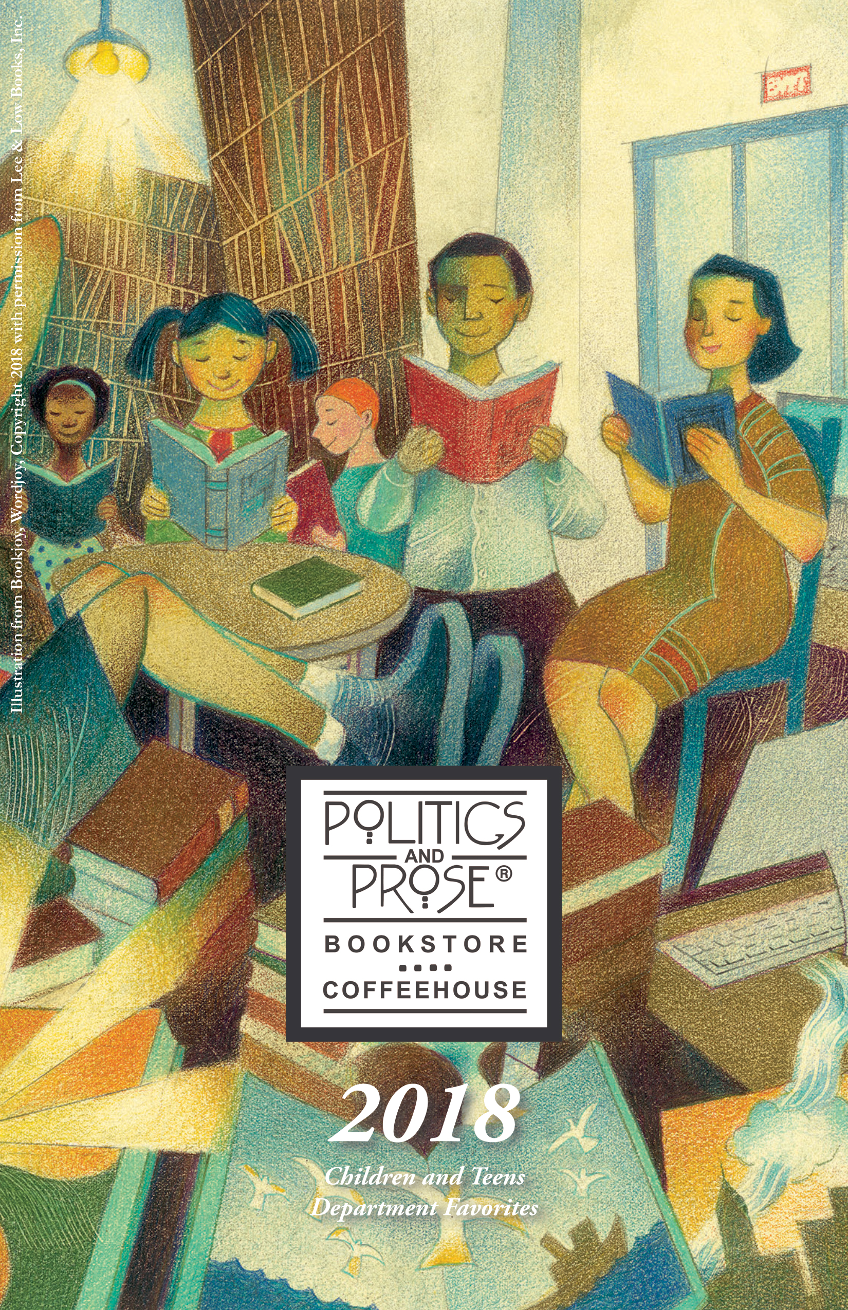
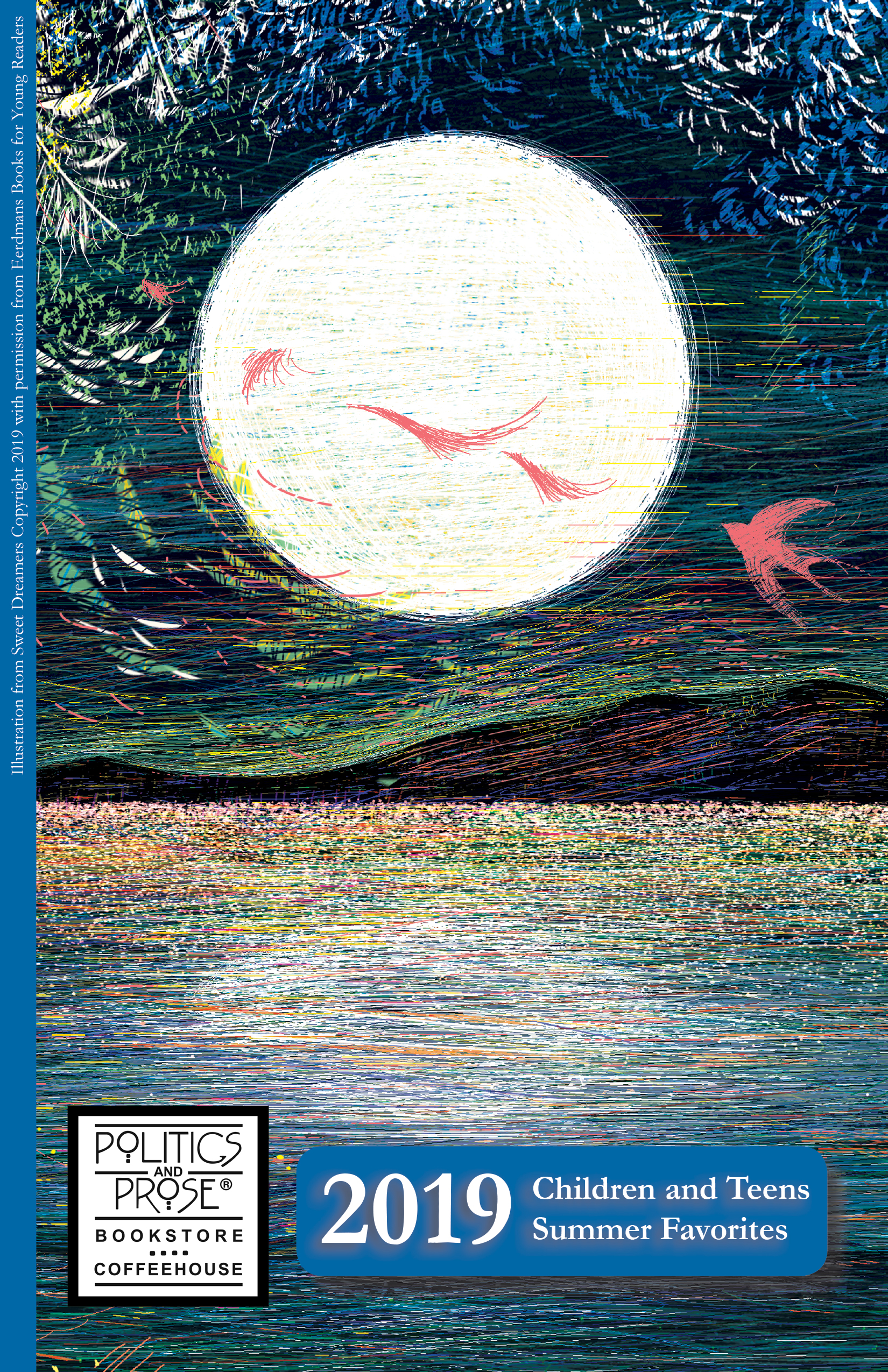
Politics & Prose Bookstore (Washington, DC)
Politics & Prose is a historic Washington, DC institution that has expanded to three stores in its storied 40 year history.
I was commissioned to do layout design for the Politics & Prose Children and Teens’ Department seasonal newsletters since 2018 to the present day.
www.politics-prose.com


Outside Time (Washington, DC)
Outside Time is an experimental music label operated by Jonathan Williger, based out of Washington, DC.
I was hired to create the entire brand identity for the label including logo, music release print layout, promotional posters, and social media assets. With the logo, I augmented the form of the letter “O” and bi-sected the shape in order to create a sharp separation of the organic form that referenced the “stepping out of time” message. In order to create a visually interesting contrast, I juxtaposed two different typographical forms: the fluidity and formality of Adobe Garamond Pro and the rigidity and boldness of Greycliff CF.


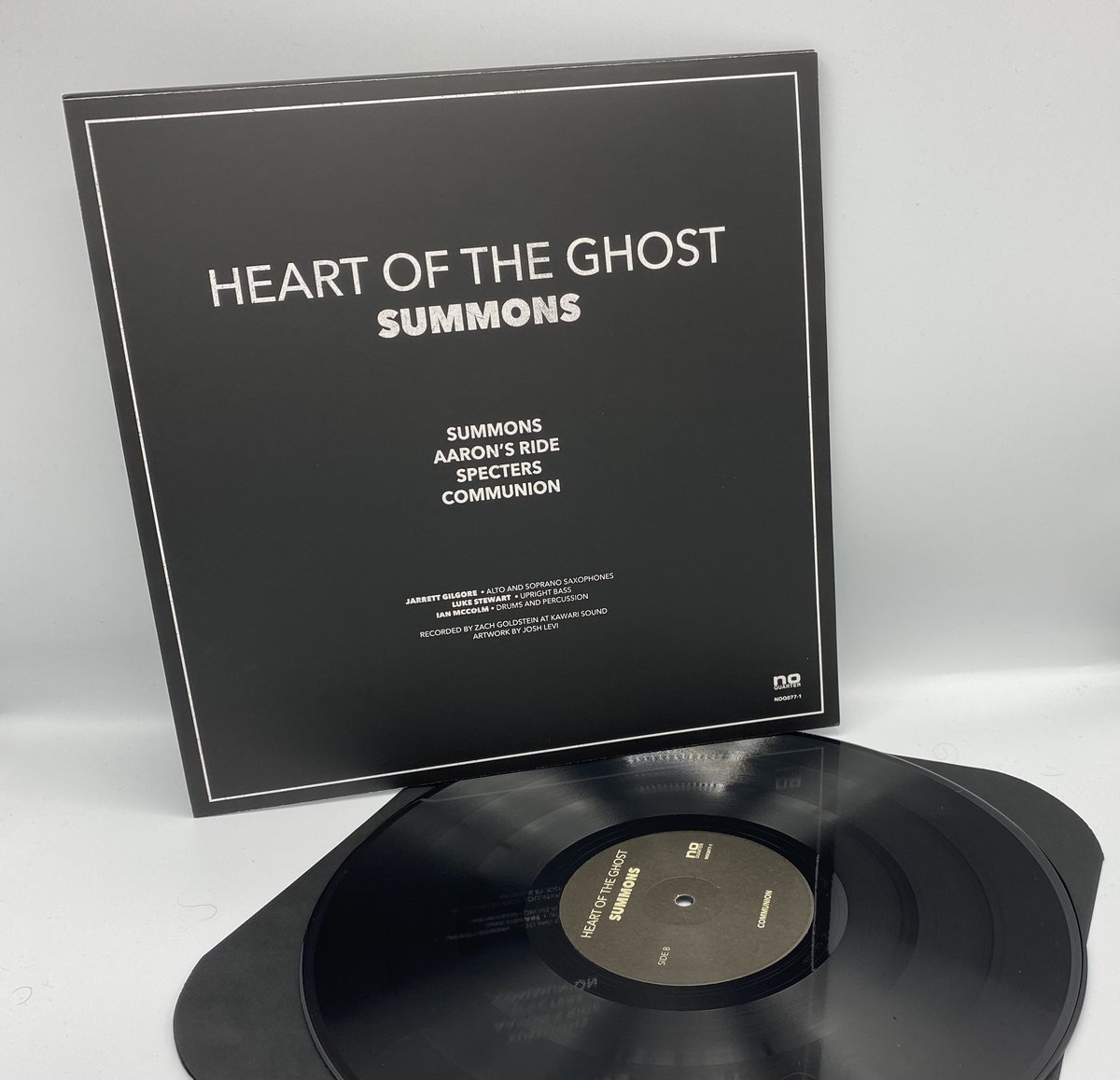
Heart of The Ghost / No Quarter Records
Heart Of The Ghost is a free jazz trio comprised of Luke Stewart, Ian McColm, and Jarrett Gilgore. No Quarter Records is a long-running experimental / free form record label based out of Erdenheim, Pennsylvania.
I was chosen by the group to create the artwork for their debut LP ‘Summons.’ I was hired by the record label No Quarter to complete the layout as well and prepare digital files for printing of LP jackets. I worked closely with both the band and label to ensure both were happy with what I created.